
In 1997, there were approximately 1 million websites, and 10 years later, there were 150 million websites.
In 2007, there were about 1 million mobile websites, and the number is supposed to reach 150 million by 2017.
People want information and services, and they want them fast. With the advancement in technology, it is possible for users to access information and services through their smartphones. Companies that have not yet adapted to mobile technology, either by building a mobile website or making their websites mobile-friendly, may miss this opportunity to attract customers.
Within a span of three years, the number of people accessing the internet via mobile will be more than those accessing it via PC. This, more than anything else, should be a clear indication for you to start working on a mobile version of your business or organization’s website.
Why You Should Have a Mobile-Friendly Website
Rise Of Smart Phones
The sale of smartphones is increasing exponentially year by year, so it only makes sense for companies to have a site that can be easily viewed on these devices.
Popularity Of Mobile Internet
According to studies, about 40% of the people who have a mobile phone use it for going online, and half of them will go online at least once every day. This presents a huge opportunity for a business to capture or define its place in their given market.
Use Of GPS
GPS is a very useful technology. It is used by many mobile users to find out the necessary things or directions. They also use it to find nearby services or businesses. If there is no mobile site available for your business then you are potentially losing a customer right in your own area.
Competitive Advantage
People love to browse while traveling or on-the-go. However, when they find that sites that they normally used at their PCs are not mobile-friendly, they might end up switching to a site that provides similar services and is mobile compatible as well.
Search Engine Optimization (SEO)
Having a mobile-friendly website also helps in SEO as it helps improve rankings on mobile-friendly search engines such as Google or Yahoo.
Compatible With All Platforms, Unlike Mobile Apps
The alternative to a mobile-friendly website is producing apps that perform similar functions. This can be a very tedious and costly endeavor. Making an app can be quite expensive and apart from that, you have to develop apps within the parameters of different platforms.
Better User Experience
Earlier, it might not have been possible to make a mobile site and give the user a good enough experience because of the low bandwidth and server speeds. However, in recent times, this has changed and you can be assured that using a good mobile site will be an enriching experience for a user.
source
Long John Silver’s Goes Mobile
Mediaura has recently worked with restaurant chain Long John Silver’s to develop a new Mobile-Friendly website. Through embracing this new technology, Long John Silver’s has increased their market reach and informational availability for customers looking for details regarding the brand.
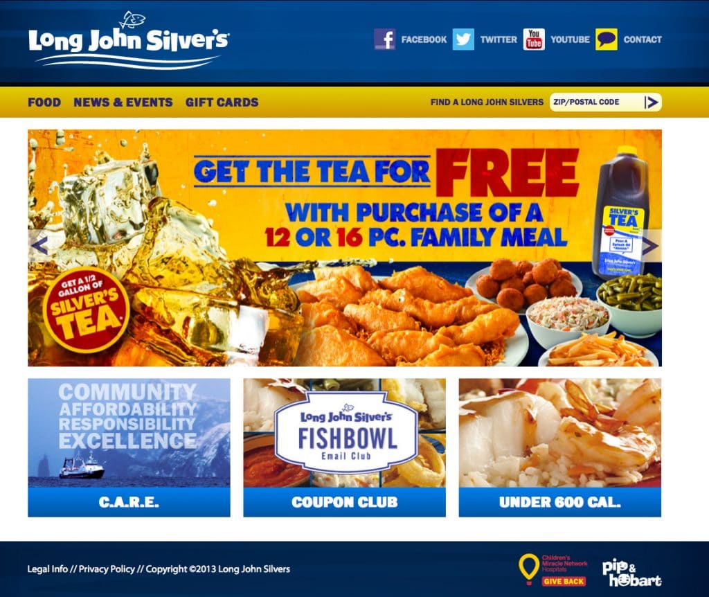
Built on a customized mobile-reactive framework, this new website will adjust its “real-estate” parameters based on the type of device it is viewed on. For example, if you were to visit http://www.ljsilvers.com/ on a desktop computer, the landing page would look like this:

Now if you accessed the same website via an iPad or tablet device, the page would automatically appear as:

You can see that the design has shifted so that all of the important information is still captured and accessible to the user, it has just been adjusted for the display area for this device.
Finally, if a users opts to view the same website on their mobile phone, the website would recognize the device and display within the viewable area as:

This is important because users are now able to quickly and easily navigate through the Long John Silver’s website no matter how they choose to access the page.
Importance Of Mobile To Consumers
It is important to mention that according to a recent study, 72% of users expect brands to have a mobile-friendly website.
66% of the consumers surveyed said they navigate to mobile sites through a search engine, and 79% said they’ll double back to the search engine if the sites they click on aren’t mobile – despite any brand loyalty present.
55% of respondents said a frustrating mobile experience hurts their opinion of a brand, but it’s more than a brand’s consumer sentiment that takes a knock. If the site isn’t mobile-friendly, 61% said they’ll take their attention—and their wallets—elsewhere.
However, if a site is mobile-friendly, 67% of consumers said they’re more likely to make a purchase.
The New Long John Silver’s Website
Long John Silver’s website now offers more than just a mobile-friendly experience. Based on user behavior and interaction, the new website is designed to quickly provide information to consumers. The website navigation has been streamlined and organized in such a way that users can now move through the website with the fewest number of possible clicks. This increases the user experience, making whatever information they seek quickly and easily obtainable.
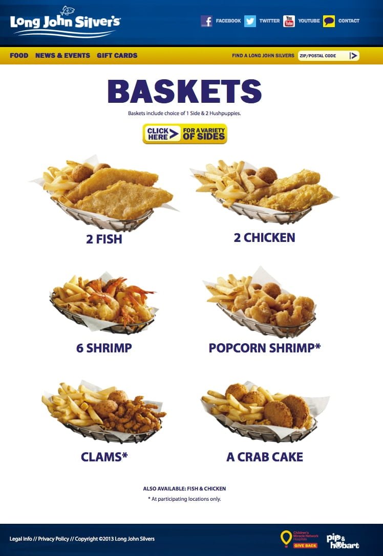
Menu Items

The new menu page categorizes items based on meal type; Baskets, Kid’s Meals, Sides & Desserts, etc. This allows the user to “drill down” and view details about products without having to search through an exhaustive menu list.
When a user selects an item type that they wish to obtain more information on (for example, Baskets); the page appears as follows:
A clean, well-organized website is vital for positive user engagement, especially on mobile devices.
C.A.R.E.
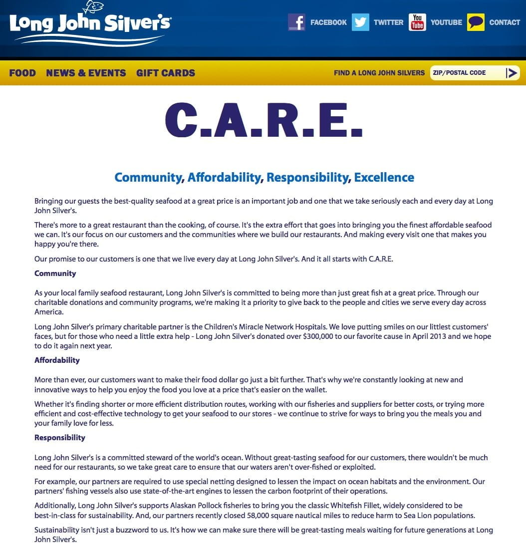
The homepage also provides a link that gives viewers information on Long John Silver’s Community and Sustainability practices. Illustrating the Long John Silver’s commitment to not only their consumers but the environment and the community as well.
Coupons

Coupons are also another frequently accessed area of the website, so the new design allows the user to quickly access or sign up for valuable offers. They can also find a store in their area from this page.
Under 600 Calories

Nutrition is important, both to Long John Silver’s and consumers. This is why the new website now lists meals available that fall under 600 calories for their dietary needs.
Nutrition Information
By navigating to the “Food” menu item and selecting “Nutrition”, users are provided with two downloadable PDF pages:
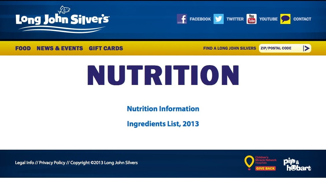
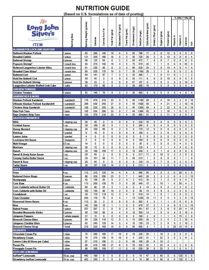
Downloadable Nutrition Guide

Downloadable Ingredients List (handy for food allergy information and dietary restrictions)
News & Events
Information about Long John Silver’s News & Events is provided on the next navigational tab:
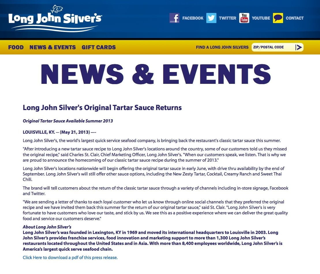
This page also provides downloadable PDFs of press releases if the user would like to print out any information provided on this page.
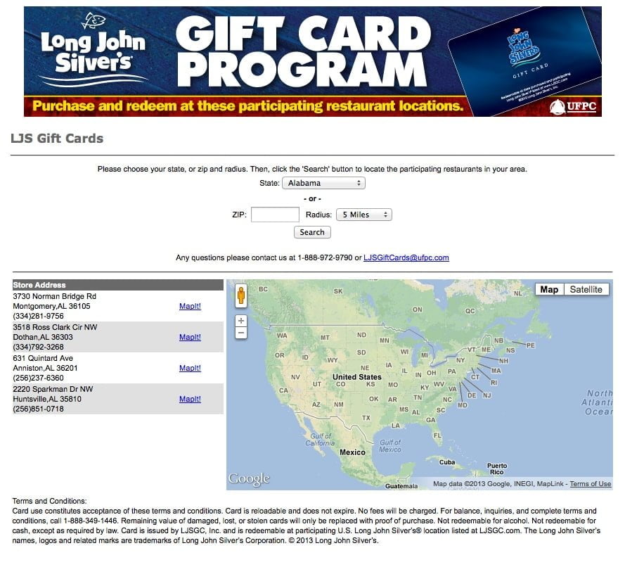
Gift Cards
For those who wish to purchase gift cards, they are taken to an area to find participating locations in their area:
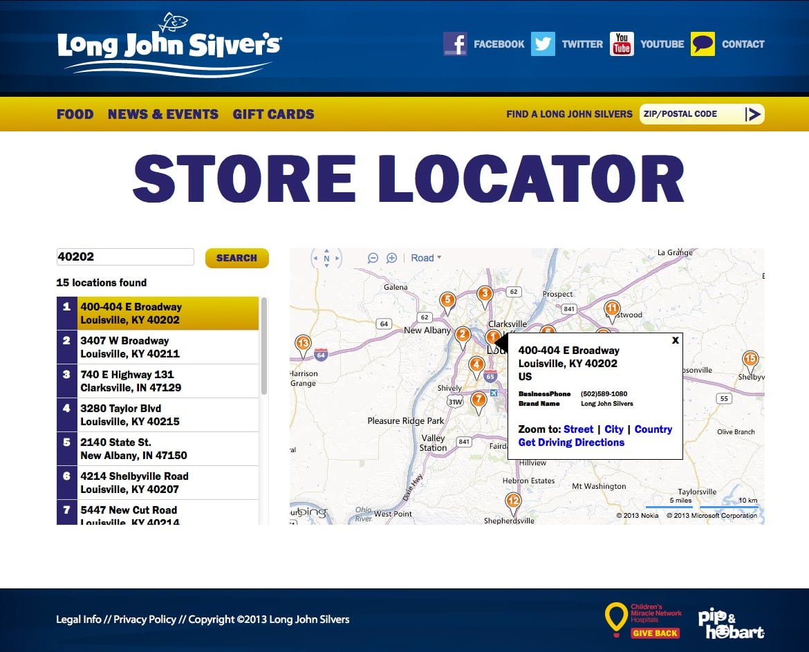
New Store Locator
The Store Locator found on the website provides users with the ability to search for a Long John Silver’s restaurant in their area, simply by searching via zip code.
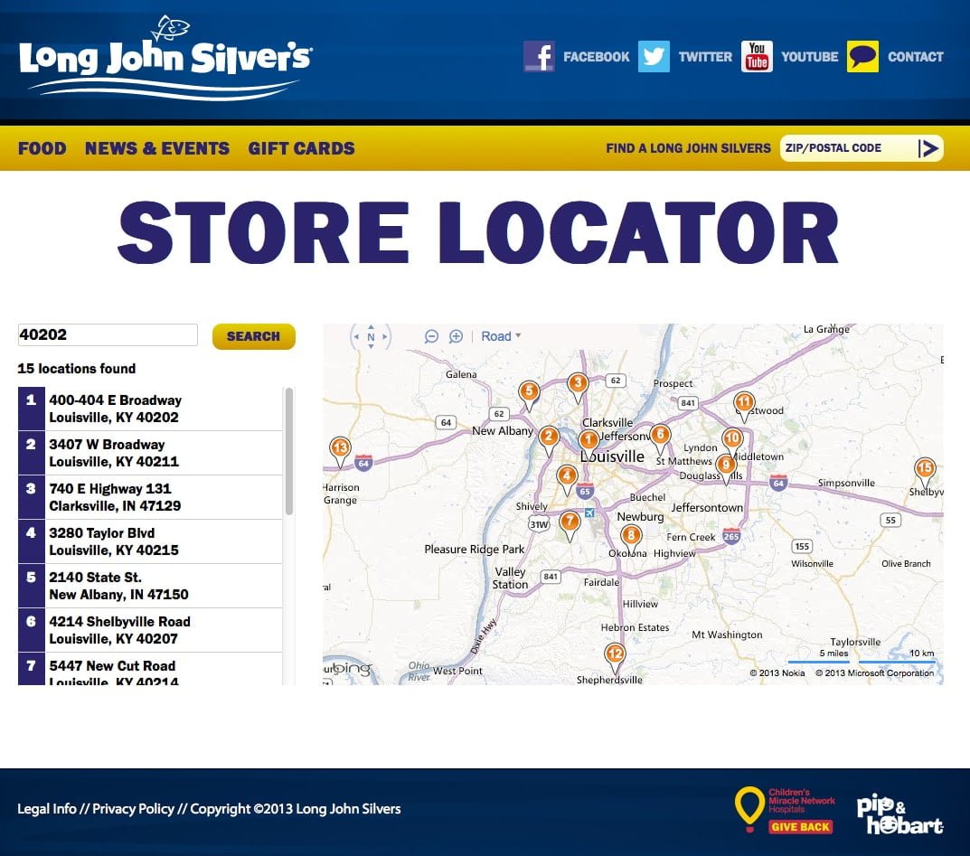
Integrated with Google Maps functionality, the accurate store listings provide both location markers and specific addresses.
If a user selects a location, the map will highlight the information, as well as show the location precisely on the map. This allows users to view locations nearest to them and obtain further directions.
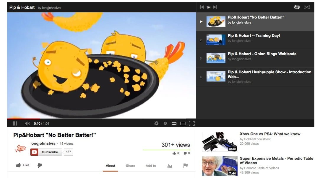
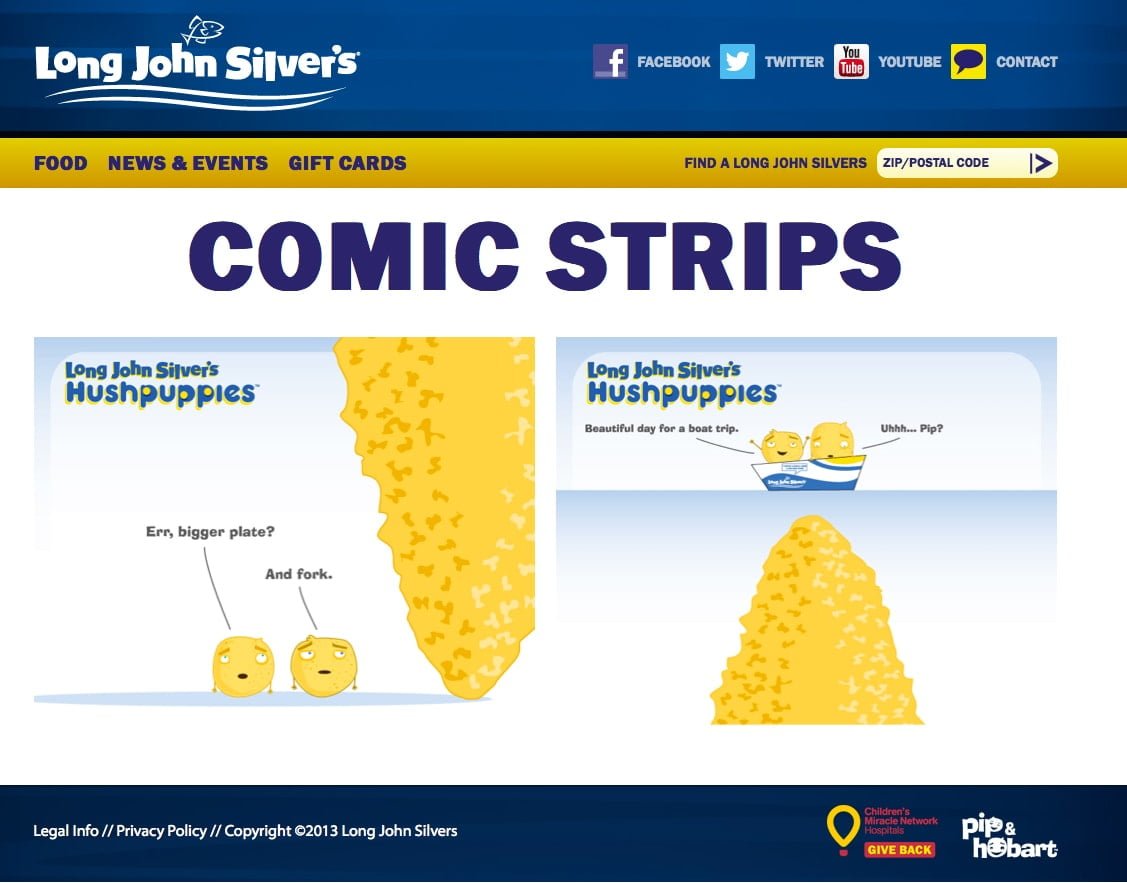
Along with social media links, Long John Silver’s also provides users with Family-Friendly entertainment through their Pip & Hobart characters.
Pip & Hobart
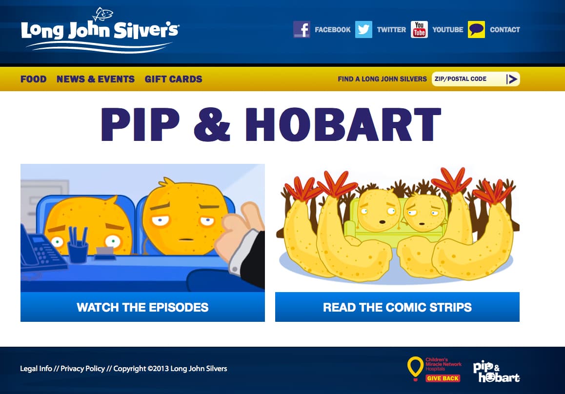
Viewers can watch Pip & Hobart animations, found on the Long John Silver’s YouTube page:
Or read one of the Pip & Hobart comics found on the website itself:
This allows viewers to be entertained and increases frequency, because new information and entertainment is being constantly added to the website. This creates a new type of interaction with the brand.
Contact Page
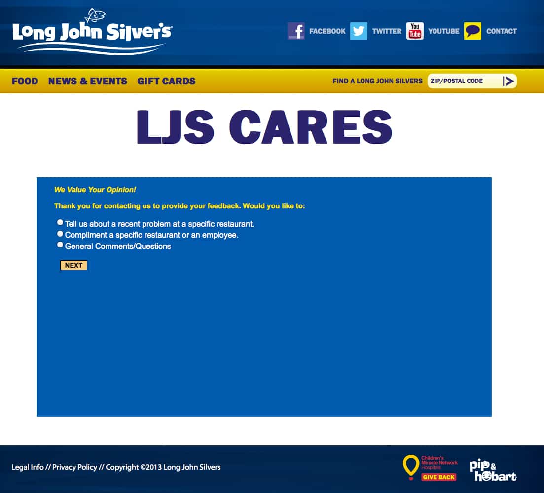
Long John Silver’s takes customer loyalty and feedback seriously. They are committed to providing excellent service and meals. Users who wish to contact the company for any reason are provided with a page to share their feedback with the company.
Check Out The New Website
Don’t just take our word for it. The new Long John Silver’s website is full of valuable information and entertaining, informative content.
To view the new Long John Silver’s website, please click here.
Conclusion
There is no doubt that the mobile-age of the Internet is upon us.
Being mobile-friendly does not just mean that your website can be viewed on mobile devices. A mobile-friendly site should be designed specifically for smaller screens, allowing easy navigation via larger touch-screen buttons, and only display relevant information and content for the users’ needs.
Don’t allow your business or organization to fall behind the trend. Contact Mediaura today to learn how we can help you go mobile and remain competitive!
