
“Build it, and they will come” is the credo that many organizations have for their digital marketing efforts. While they are to be applauded for venturing into the digital realm with their advertising, simply building a website isn’t enough to generate website conversions that lead to sales.
These days the “build it” portion is much more complex than ever before, and websites that are designed without best user interface practices in mind will not find success. Users find your website, but don’t feel compelled to do much more beyond that. However, companies that take a structured and organized approach towards optimizing their conversion rates are twice as likely to see a large increase in their sales.
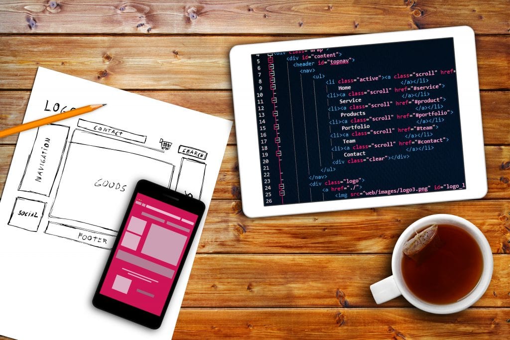
Get Your Website To Work For You
Did you know that studies have shown you have less than 10 seconds to convince visitors to stay on your landing page? Users that don’t feel as if their needs are being addressed, cannot navigate efficiently, or are simply overwhelmed (or underwhelmed) with your design will be gone.
According to reports the most relevant type of website conversions are:
- Sales
- Sign-ups/Registrations
Considering how important website conversion rates are to the bottom-line of many organizations, you think they would test and run experiments to see what works for their unique consumer. Yet 61% of companies do less than 5 tests per month.
Approximately 96% of visitors that will come to your website are not ready to buy, so it becomes even more paramount to win them over – and make it easy for them to convert. If you’re not taking the time and putting in the effort to maximize your website conversions, you could be losing money and clients to your competitors.
Make Your Unique Value Proposition(s) Clear
Many companies fail to highlight their value in the correct manner on their landing page. Also known as the unique selling proposition (USP), your UVP is a clear statement that describes the benefit of what you are offering, how you solve consumer needs and what it is that distinguishes you from your competition.
Don’t confuse this with your mission statement. This is a common mistake I see many businesses making with their website’s landing page. Your mission statement is business-centric, whereas your value proposition is visitor-centric. Your UVP should clearly speak to your visitor’s needs.
If your visitors don’t see the benefit of signing up, or they have to click-away in order to do so, they are more likely to search for a solution elsewhere.
If they leave your landing page prematurely because of a message that isn’t compelling or a process that is too demanding of their time, you’ll have about a 0% chance of converting them into a sales or a lead. In this scenario, you’ve built your website, they’re coming, but they are leaving you with nothing to show for it.
What Makes A Good UVP?
No matter what type of service or product your organization offers, there are a few elements to keep in mind:
- Quickly and clearly convey the value of what you are offering.
- Explain how your service/product is different from that of your competitors.
- State benefits as well as features.
- Address the key needs and main points of your target audience and underline how your offering is the solution.
- Avoid superlatives such as “the best” or “world-class,” as well as any jargon or acronyms.
- Use layman’s terms to convey your offering to even the most uninitiated audience.
- Use customer-centric language rather than company-centric language (remember, this is NOT your mission statement). Steer clear of using the words “we,” “our” or “I.”
Keep Them Longer Than 10 Seconds
You may know your UVP by heart but your visitors don’t, so make it loud and clear.
How can you ensure your UVP is quickly noticed and understood by your visitors within those first 10 critical seconds of them arriving on your landing page?
- Have a short but powerful headline that helps summarize a key aspect of your UVP (in less than 10 words).
- Have a supporting sub-headline or short paragraph to help explain or clarify your UVP.
- Have a short bulleted list of the benefits/advantages of using your product/service with supporting visual imagery (for example: icons, badges or a hero shot).
- Show all of the elements above the page fold (the area that visitors can see initially without having to scroll).
If you want users to sign-up, register, call or email – make it simple. You should require the least amount of information possible. Remember the more you ask for, the more time you’re giving them to reconsider volunteering the information.
Contact forms should be short and sweet and displayed prominently above the fold. Phone numbers should be easily accessible. Store locations or address information (if necessary) should take users very little time to get to.
Perform A/B tests to see what method users respond to; don’t make the mistake of knowing how they’ll respond.
Mediaura Can Help
We know how to build websites to maximize your visibility and help you achieve your goals. As a full-service digital agency, we help our clients increase their ROI by leveraging digital solutions.
For additional information about leveraging your digital or for any of our other services, please Contact Us or call Mediaura at (502) 554-9649 today to get your digital presence where it needs to be.

