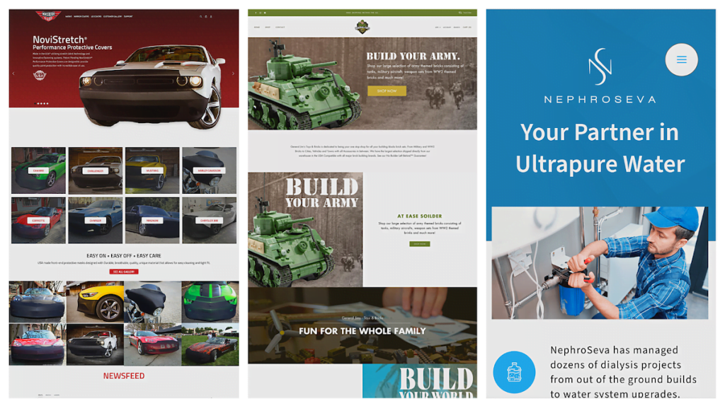
We’ve been busy at Mediaura. That’s why we’re announcing the launch of not 1… not 2… but 3 new websites.
When we realized that all three of these websites would be launching at the same time, we were like, hey, that’s pretty impressive. But we were also like, huh, which one of these very beautiful, very functional websites do we tell the world about first?
Do we fill them in on the brand sparkling new site we created for a health care client? Or, do we fill them in on the Shopify sites we deftly redesigned?
Well, we couldn’t pick a favorite. So, we’re going to tell you about all of them all at once in a (What’s that? … Yep, exactly.) A roundup!
Let’s start with those redesigns.

The New NoviStretch
NoviStretch is a client for whom aesthetics are important. They create protective (and sleek) sports car covers for clients who love their vehicles and want to make sure they stay looking good. But their old website was dated and skimpy on the visuals. Not what you would expect from a business with their level of product and in their line of work.
We changed that with a website that uses a “show, don’t just tell” approach, nixing their text-heavy sidebar and multiple columns in favor of a photo-centric single-column layout. This has the (extremely important) bonus benefit of being mobile-friendly.
The new site leads with visuals, featuring a rotating carousel of NoviStretch’s products at the top of their homepage and a prominently displayed “Made in USA” logo. Instead of prompting site visitors to “Shop By Vehicle” with words alone, the New NoviStretch features the pictures, as well as the names, of all the vehicles they manufacture covers for — photos that double as links to the site’s Shop.
As happy as we are with NoviStretch’s new look, it’s not the only thing we did for them that we’re proud of. We also reorganized their website for an easier shopping experience, making sure each car had its own category.
Now, visitors to NoviStretch’s site should be revved up to make up a purchase.


General Jim’s Toys & Bricks Reimagined
Our mission was clear: Create a new website for General Jim’s Toys & Bricks, a purveyor of building block sets specializing in military models.
The path forward, though, was not so obvious.
In operation since 2020, General Jim’s Toys & Brick’s old site had a fun concept but a barebones web design, featuring product photos on white backgrounds and not much else.
We blazed the trail — with the General’s guidance, of course — creating a color scheme for the site based off of the existing logo. We also took high-quality product photos of General Jim’s bestselling products, Photoshopping them onto engaging backgrounds.
The result? A site that unlocked all the potential that General Jim’s was brimming with.
And the General liked it so much, he’s given us new orders: To run their social media profiles on Facebook and Instagram. Give them a follow!


NephroSeva Gets A Website

NephroSeva had a lot going for it: A budding business with an important mission, to provide comprehensive ultrapure water services to companies that need it, particularly those servicing dialysis patients. And a leadership team with the decades’ worth of experience necessary to carry that out.
They just didn’t have a website.
Supplied with nothing but a logo, a brand color, and the owners’ dreams, we created one for them — one that, we’ll say it, simply flows. The site clearly communicates NephroSeva’s story and offerings, and with illustrations of water jugs and a clean blue and white color scheme throughout, you never forget what the site, and NephroSeva, are about.
Want a well-thought out website for your business? Let us know.

Danielle Grady is a Social Media Specialist at Mediaura, where she manages digital strategy, content creation, and analytics for multiple brands across platforms like Instagram, TikTok, and LinkedIn. With a background in journalism and digital content editing—including roles at LEO Weekly and News and Tribune—Danielle brings a data-driven, creative approach to brand storytelling and audience engagement. She holds a B.A. in Journalism from Ball State University.


